PWHL Penalty Kill Rule Analysis

Hello again, it’s been a while. I came up with a relatively simple analysis that I think is pretty interesting. 

DEFINITIONS

PP: Power Play, when the opposing team commits a penality and the team in question is at a man advantage with usually 5 players to the opposing team’s 4. Sometimes there’s a two man advantage (5 on 3). Usually the penalty is a minor, which means two minutes. If the team on the Power Play scores the penalty ends.

PK: Penalty Kill, the team at a man disadvantage during a penalty.

Minor penalty: Two minutes and if a goal is scored on the Power Play the penalty ends. Sometimes a double minor is assessed, which is four minutes and one goal can be scored on each minor.

Major penalty: Five minutes and a goal scored on the Power Play does not nulify the penalty.

SHG: Shorthanded goal, a goal scored by the team on the Penalty Kill. Currently in the NHL this does NOT nulify the penalty, but in the PWHL it does.

BACKGROUND

For some background there’s a new women’s hockey league called the PWHL or Professional Women’s Hockey League. There’s a rule that created a little bit of buzz in the league. If a team scores shorthanded it nulifies the Power Play. I excluded 5 on 3 Power Plays and majors because that would add significant complications to the analysis and both are very rare.

Many people claimed it would make the PK more aggressive resulting in both more goals shorthanded and Power Play goals against. Originally I thought that making the penalty kill more aggressive and opening up your team to more Power Play goals against just to score a few more shorthanded goals and nulify a few Power Plays was a ridiculous idea. After all teams score so much more on the Power Play than shorthanded. I assumed that it would be a net negative value-wise and no team would employ this strategy. However I decided to test my hypothesis and thus this project was born.

ANALYSIS

  1. A look at how at the break-even point of how much worse a PK can get in order to break-even in terms of goals given up and scored/saved. 
  2. A look at whether this strategy would significantly increase scoring league-wide.

***All stats are from the 2022-23 season***

SCENARIOS

The following are the possible scenarios that may result from this analysis:

  1. Most teams would find it valuable to alter their PK strategy based on this rule. 
  2. Most teams would NOT find it valuable to alter their PK strategy based on this rule.
  3. Somewhere in the middle. Around half of the teams would find altering strategy valuable.

In addition there would be scenarios associated with whether league scoring would increase if this rule were implemented. The following are the possible scenarios for this happening:

A) League scoring would increase significantly if all teams implemented a new PK strategy and even if only the teams that it was valuable for would implement it.

B) League scoring would increase significantly if all teams implemented a new PK strategy but NOT if only the teams that it was valuable for would implement it.

C) League scoring wouldn’t increase significantly even if all teams implemented the new strategy.
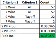
PART 1

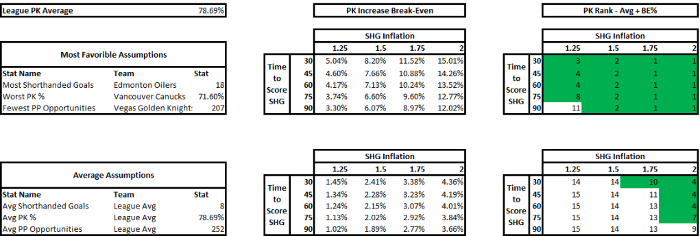
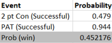
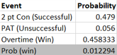
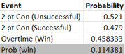
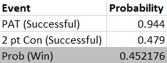
The above is part one of the analysis. The top half are the most favorable circumstances for this rule to provide positive value as its assumptions. I used the team with the most shorthanded goals last season in Edmonton which had 18. The more shorthanded goals they score, the more shorthanded goals the extra aggression will result in. Therefore adding value to the team. In addition I used the team with the worst PK in the league last season in Vancouver. The worse the PK the more goals being saved by nulifying the PP with the new rule. Finally, I used the team with the fewest Power Play opportunities in Vegas. The fewer Power Play opportunities the fewer Power Play goals given up due to the aggressive PK when not scoring a shorthanded goal.

The bottom half is the same as the top half but using average stats. 

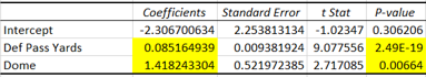
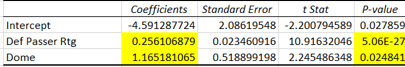
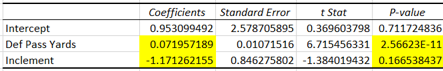
The Matrix on the left takes into account two variables as inputs: how much time it took to score the shorthanded goal on average and the shorthanded goal inflation, a multiple that will measure by how much the shorthanded goals increased due to the extra aggression. Time to score adjusts how likely that a Power Play goal would have been scored during a Power Play when a shorthanded goal was scored, if it hadn’t been scored. I made an assumption that probability to score is linear, a team is as likely to score in the 90th second as the 30th. For the purposes of this analysis a team that allows a shorthanded goal 30 seconds in on average that has an 80% PK (probability that a goal will be scored would be 20%) will have the effectiveness go down by a factor of 30/120 or 1/4 to ((100%-80%) * (1-1/4)) to 15%.

The outputs of the Matrix is PK % break-even point. This is by how much the PK % can go down for Power Plays where a shorthanded goal wasn’t scored to break-even (or be net zero). If the PK % goes down by less the team is net positive, if it’s more it’s net negative.

The calculation is as follows:

Value gained / Power Play opportunities where no shorthanded goal was scored

Value gained is measured by additional goals scored by being aggressive (current shorthanded goals * (SHG inflation multiple – 1)) and the hypothetical goals avoided by the nulification of the Power Play. This calculation takes into account the PK %, shorthanded goals scored (including the SHG inflation multiple) as the opportunities and how much time it takes a team to score shorthanded on average. 

PP opportunities where no shorthanded goal was scored is simply PP opportunities minus shorthanded goals multipled by the SHG inflation multiple.

Finally, the matrixes on the right put these break-even PK % in perspective. I added that percentage to the average PK % in the league and measured where it would rank. I treated 10th or higher (colored green) as a significant PK % change. If it was 10th or higher that means that the break-even point is significantly high and therefore the PWHL PK rule would more than likely provide positive value.

My finding was that if your team has the most favorable circumstances this rule change provides value, but unless you expect your team’s shorthanded goal scoring to increase significantly, the average team has no value in this rule.

PART 2

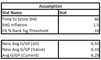
For part 2, I wanted to see if scoring would increase league-wide if this rule were implemented. I applied the above assumptions. 60 seconds to score a shorthanded goal and a 1.5 bump were average assumptions from the previous exercise and the PK % rank significance threshold means that the PK % would decrease by the amount that would bring the average PK % up to #10 overall, if added to it. This was the lowest threshold of what I’d consider significant.

I assigned two metrics to each team in the NHL. 

  1.  The value gained or lost by this rule. That’s the previously discussed value of additional shorthanded goals scored + PP goals saved – additional PP goals allowed.
  2. I assigned a number for how many additional goals would be added to a team’s games. This is additional shorthanded goals scored + PP goals allowed – PP goals saved.

I discovered that only 5 teams have a positive value in being more aggressive given the above assumptions. 

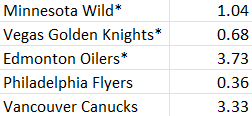
The drivers were PK (poorer was higher value) and shorthanded goals (more was higher value).  Four of the five teams were in the bottom half of the NHL in PK (Minnesota was 10th), the rest ranged from 19 – 32.  All of these teams scored 10 or more shorthanded goals (8 was the average per team). 

The bottom number in the bottom table of the screenshot is the average goals in a given game in the NHL last season. The top number is if all the teams bought into the strategy of being more aggressive. The middle number is if only the five teams identified above implemented the strategy. If only the teams that it was worth it for employed the strategy, the bump in scoring would be minimal (~0.04).  However, if all teams did it was a little more significant but not as significant as one would think (~0.26).

1705717697007.png

There was a significantly bigger bump in just one year between 20-21 and 21-22, this bump would be about equivalent to0. the difference between the high scoring 05-06 season and 22-23.  So not insignificant but not drastic either.

My analysis is that given these assumptions (SHG inflation is by far the most significant because it adds value to teams and directly impacts scoring), if there’s universal buy in the rule might make a significant but not drastic difference.  However, if coaches whose teams it’s not advantageous for don’t buy in it’ll make no significant difference.  These are scenarios B and 2 listed in the scenarios section.

I posit that only a few coaches would have a more aggressive PK because for most teams it wouldn’t be advantageous and as a result the league-wide scoring won’t increase by a whole lot. 

Sources:

https://www.hockey-reference.com/leagues/NHL_2023.html#all_stats

https://www.statmuse.com/nhl/ask?q=average+goals+scored+per+game+combined+nhl+every+year+2005-06+to+2022-23

Probability of Defending Champs repeating as Cup winners from 99-00 through 15-16

Hello! I had about a year and a half of writer’s block, but good news! I’m back with my most interesting and intellectually challenging project yet.

Recently the Tampa Bay Lightning of the NHL became just the second team since the 97-98 Detroit Red Wings to repeat as Stanley Cup champions. The first were the 16-17 Pittsburgh Penguins. However, there was a sizable gap between the Red Wings and Penguins. I wanted to quantify the probability of each defending champ repeating each year in that time frame. I looked at all defending champs from 99-00 (98-99 would have been a threepeat, not a repeat) through 15-16 and quantified (using regular season win % in regulation and math) that these teams repeated as champs. It’s important to note I originally tried to quantify this streak of no repeat winners overall but realized that the math won’t work, so instead I quantified each team each year separately.

There are a few caveats to the data:

  1. As already mentioned, I looked at only the regulation wins and losses of teams in the regular season. 3 on 3 overtime, 4 on 4 overtime, and shootouts don’t exist in the playoffs so the easiest thing to do was just eliminate those games altogether.
    1. It’s not perfect since overtime games DO exist in the playoffs but I thought it was a good mix of efficient and effective.
    2. I recognize that regular season records aren’t a perfect measure. This doesn’t account for in season player trades (especially ones later in the year) and coaching changes. The 11-12 Los Angeles Kings were an 8 seed but had an active trade deadline, for example. Also, this doesn’t account for momentum if one believes in that. Finally, This doesn’t account for experience. The Chicago Blackhawks in theory had a better shot to repeat than other teams.
  2. I did not include the new conference setups. Until 13-14 the matchups were simple. The three division winners take the top 3 spots and 4-8 is ranked by points and if there are ties, tiebreakers are used. Starting from 13-14, there was a wildcard system incorporated that has complex matchup scenarios. For simplicity purposes I used the old method from NHL.com’s conference page where the top two seeds are division winners and every one else is ranked by points.
    1. This only affected the 15-16 analysis because in 13-14 the Blackhawks made the conference final and therefore seeding didn’t matter because we knew who their opponents were that were needed to win the cup. The 14-15 Los Angeles Kings didn’t even make the playoffs so their probability of winning the cup was 0%. More on these scenarios in the next bullet point.
    2. I don’t think it makes much difference. In addition to it being relevant only for one season’s worth of data, the new matchup setup is somewhat random and more heavily influenced by the strength of divisions.
  3. Since I’m looking at seasons that already ended I’m assigning any series wins a probability of 100%. For example, the 99-00 Dallas Stars won the first three rounds of the playoffs and lost in the final round (Stanley Cup final), I assigned their probability of winning the cup that year as their probability of winning just the one series, and effectively assuming that they won their first three rounds with a probability of 100%. It doesn’t make sense to assign them anything else knowing what happened.
    1. One way to look at it is if all 16 defending champs missed the playoffs then it wouldn’t even make sense to model out the probability of winning the cup since it would be 0%. Similarly, if all defending champs lost in the cup final it would be a little absurd to give them a probability of say 5% each of the 16 years.
    2. The way to look at it, what was the probability all of these teams wouldn’t have won the cup given the actual results of the series they’ve won. The only rounds that got modeled out are round that the teams lost in and all of the hypothetical rounds in the future.

I’ll now get into methodology. High level, I started by getting the win percentage of regulation games for each team (Regulation wins/(Regulation wins + Regulation losses). Then I used the below formula to calculate head to head matchups and the probability of winning one game for each team. I used home and away percentages and calculated home wins, home losses, away wins, and away losses. The formula for each individual game win is one that I’ve used before in my blog:

Win Probability Formula

W= win

P= Probability

A = Team A

B = Team B

Below is the source that I used:

https://sabr.org/journal/article/probabilities-of-victory-in-head-to-head-team-matchups/

After getting the probabilities for home/away wins/losses, I used probability and combinatorics to model out out the probability that a given team wins in 4, 5, 6, and 7. The first step in calculating this is modeling out every combination of wins and losses (by home and away games) for each series length.

Let’s look at a team with home ice advantage. The games that this team plays are set in stone. Let’s say their win probability for a particular matchup 60% at home, and 45% on the road. FYI, H = Home, A = Away, W = Win, L = Loss

4 games:

HHAA

The only way to win that series is by winning all 4 games.

WWWW

This is the simplest scenario of just multiplying the win percentages. 60%*60*45%*45% or 60%^2*45%^2 = ~7%.

However for 5 games it becomes a little more complicated.

5 games:

HHAAH

The loss could occur at home or away and that needs to be accounted for.

Home loss example:

LWWWW

40%*60%*45%*45%*60% = ~3%

Away loss example:

WWLWW

60%*60*55%*45%*60% = ~5%

Another thing that needs to be taken account is all possible games that a loss can occur for these two scenarios. For example, a loss at home can happen in the following three ways:

LWWWW

WLWWW

WWWWL

An away loss can occur in the following two scenarios

WWLWW

WWWLW

Therefore the way to calculate it is by taking one possible combination with a home loss and multiplying it by 3 and taking one possible combination with an away loss and multiplying it by 2, then adding them up.

In this situation it’s easy to calculate that there could be 3 different positions for a home loss and 2 for an away loss. But once it gets into 7 games it becomes more complicated. These are really combinations. In 3 home loss scenario we’re doing a combination of 1 win out of 3. The formula for a combination is:

So 1 combination of 3 is 3C1 or 3!/(1!*2!). The “!” notation is referred to as factorial and is calculated in the following way: 3! = 3*2*1 = 6. So 3!/(1!*2!) = (3*2*1)/(1*2*1) which equals 3. 2C1 will equal 2. And you will notice that these are the two numbers already mentioned.

One note, there also something called the permutation that’s n!/(n-r)!, this is where order matters for the objects that you choose. Since losses are losses, combination is what’s relevant here.

One final step, someone with an eagle eye might have noticed that one possible scenario with a home loss is WWWWL. Anyone that knows the playoff format knows that’s impossible, as soon as a team wins 4 the series ends. However mathematically it’s possible. So this one probability needs to be taken out from the overall probability. One word of caution is not to just take out the probability of a sweep, because in 5 games the impossible probability isn’t WWWW (a sweep) it’s WWWWL. If as in this example the team has home ice this series a sweep multiplied by a home loss needs to be taken out of the total.

A similar process is repeated for the 6 game series where 3 different scenarios are possible (HL/HL, AL/AL, and AL/HL). It gets complicated for the scenario where there’s one home and one away loss. One combination needs to be multiplied by 3C1 and again by 3C1. There are 3 combinations of home losses AND away losses. Also, in the end the probability of a 5 game win followed by a loss needs to be taken out of the equation, as well as a probability of a 4 game win followed by two losses. The losses need to correspond where the games take place (home/away). 7 games is similar but the combinations get more tricky. In one scenario 2 home losses happen out of 4 (remember this is only for the team with home ice, the away team has this scenario for away losses). This is 4C2 or 4!/(2!*2!)=6.

That was the heavy lifting for the math. However, that’s only one round. Because each first round is set, that was the first round. For rounds 2 and 3, I mapped out all of the possible scenarios. There are 16 possible scenarios for round 2 and 4 scenarios for each of the 16 for a total of 64 in round 3. I used the same math to arrive at each possible scenario.

The final calculation was looking at all of the possible scenarios needed for the defending champ to advance through the rounds. In the second round it’s every scenario where the defending champ advances, their opponent advances, the defending champ wins their series and the two teams on the other side advance and each scenario in the other matchup happening (each team winning). For example in one scenario for the first round, if the defending champ is the 1 seed, the scenario where 1 plays 4 and 2 plays 3, the probability that 1 wins in the first round gets multiplied by the probability that 4 wins the 1st round and multiplied by 2 and 3 winning in the first round and 2 wins OR 3 wins (2 wins the matchup plus 3 wins the matchup). This calculation is done for each scenario and added. For round 3 a similar calculation is made using each of the 64 scenarios and the probability of each team getting there with the defending champ winning. In the cup final the actual cup finalist was used since the finalist comes from the other conference and no scenario in the defending champ’s conference impacts anything that happens in the other conference.

As previously mentioned the calculation was much simpler when the defending champ won rounds (in the real world). If they won one round (only the 09-10 Penguins did), the matchups were set in stone in the second round, and the probability of them winning the second round just becomes the probability of them winning that matchup. In the third round if the Penguins ended up winning their second round matchup they would have faced the 7th seeded Philadelphia Flyers, so the calculation only takes that scenario into consideration. Defending champs that lost in the conference final required the probability that they would have won their actual conference final matchup and the theoretical final matchup, and those that lost in the Stanley Cup final required just the probability of winning that final series. A note on the 06-07 Carolina Hurricanes and 14-15 Los Angeles Kings, they both missed the playoffs and were treated as 0% probability of winning the cup and were thus omitted from this analysis.

In the end, my final output was each defending champ’s probability of winning the cup. They range from the 2005-06 Tampa Bay Lightning (0.3%) that were an 8 seed and lost in the first round to the 08-09 Detroit Red Wings that made it to Stanley Cup final and were a 2 seed with a strong home regulation record (71% win percentage) playing a 4 seed with a weak away regulation away record (46% win percentage).

Sources:

https://www.hockey-reference.com/

https://www.nhl.com/

NHL Coaches Analysis

I’m back!  It’s been an almost year-long hiatus.  This latest project is a ranker of NHL coaches based on the performance of their players under other NHL coaches.

The two major stats I used were Corsi For % (CF%) and PDO.  These are popular advanced stats in the NHL analytics community.  CF% is a possession stat that looks at shots attempted by a team on net (shots on goal, blocked shots, and missed shots) while 5 on 5 divided by these attempts total for both teams.  This stat is supposed to gauge how much a team had the puck and correlates well with winning.

Hereafter, Corsi For (shot attempts for) will be classified as CF and Corsi Against (shot attempts against) will be classified as CA.

PDO is a stat that looks at shooting percentage 5 on 5 plus save percentage 5 on 5.  This stat is supposed to regress to 100% and anything above is considered good luck and below is considered bad luck.

I regressed both of these variables in each season from 07-08 through 18-19 (07-08 was the first season this data was available) against team points because looking at both paints a more complete picture.  Furthermore, if I were to compare players on different teams I can’t just look at CF% if a certain team had a much higher PDO they would be more successful.

For 2012-13 I projected the point totals over an 82 game season since it was a lockout-shortened season where only 48 games were played.  The projection was simply made by multiplying each team’s point total by 82/48.  I also made a similar adjustment for the 2007-08 New York Islanders.  They played 81 games under Head Coach Ted Nolan and 1 game under Al Arbour.  In order to keep the data from that season, I adjusted all of the stats for that one game including point totals.  There I took out the points that were won in the one game Nolan didn’t coach and multiplied the resulting point total by 82/81, it was for all intents and purposes treated as an overtime loss as the projected points from that game were around 1.  I did the same with the CF%, deleting the Corsi for and Corsi against from that one game (68 for and 40 against).

This was the output of the regression I ran:

CF%-PDO Regression

As you can see the p-value for both variables and the intercept are highly significant (<0.05) and the R Squared is predictive at 84%.

Next, I went about collecting data (CF, CA, CF%) for individual players for the same time period, as well as the coaches that coached the team at the time.

I originally thought that CF% would depend on experience.  Perhaps rookies performed worse, as did older players.  However, I plotted the CF% by experience and saw no pattern, nor much of a difference between worst performing and best performing.  Therefore I decided not to adjust the data for this variable.  Below is the chart:

Corsi by Experience V2

For individual player data, I used players that played 60 games or more in each of the relevant seasons and 35 games or more in 2012-13 the lockout-shortened season.  I chose 60 games because it’s a larger sample size, more likely to have legitimate NHLers rather than farm club call-ups and because it made the data more manageable.  35 is about the same amount of games proportionately for a 48 game season as 60 is for an 82 game season.

I also deleted players that played for more than one team in a given season.  The data source I’m using doesn’t identify those teams and therefore I couldn’t link those players with any coaches.

For the coaches’ data, I identified who the coaches were per team per season.  Most teams only had one, some had two, and in the relevant years, only the 2011-12 LA Kings had three.  They won the cup that year, so perhaps that was their secret.

As previously mentioned the 2007-08 Islanders were listed as having two coaches but I treated them as a team coached by only Ted Nolan.  I made all of the appropriate points and stat adjustments, for the players and the team.

I excluded the teams that had seasons with multiple coaches because there wasn’t a way I could assign Corsi to the appropriate coach in a reasonable way.  I did, however, use these teams when comparing players’ performance under different coaches.  For example, if Jaromir Jagr played for a team coached by Tom Renney of the Rangers and we want to look at his CF% for other coaches and he played in another season for a team that had two coaches not named Tom Renney, I would include that in the comparison since it doesn’t matter which of those coaches had what Corsi, all that matters is that season’s Corsi.  Furthermore, if Jagr played in 08-09 under Renney and Tortorella (this is hypothetical since he didn’t), that season wouldn’t make it into Jagr’s average of stats that he compiled under different coaches.

To compare players’ performance under different coaches I used a slight variation of the CF% statistic, called relative CF%.  Relative CF% takes into account the fact that better teams would inflate individual player CF% and worse teams would deflate it.  So this statistic measures how the player does in terms of CF% while he’s on the ice, compared to what the CF% is when he’s off the ice.

The statistic is already tracked for each player in a given season.  However, I had to estimate for the average the players had under different coaches.  In order to do that I projected Corsi events (CF + CA) for the games a player played.  I did so by taking Corsi events per season and adjusting it to the number of games played by each player.  This was done by multiplying Corsi events by games played by a given player divided by games in a season.    I then took these projected events and subtracted the Corsi events for each player to get the Corsi events of when they were off the ice.  From there I used relative Corsi% to estimate the CF and CA while the players were off the ice.  I subtracted relative Corsi from actual Corsi to get CF% while the players were off the ice and multiplied that by the events to get CF while off the ice, subtracting that from the projected off-ice events, yielded CA while off the ice. Finally, looking strictly at the data of the players under other coaches, I summed up the CFs for each season divided by events and subtracted CF divided by events while off the ice.  The result was the relative Corsi for each player.

Next, I took this estimated relative Corsi and added it to the off-ice CF% of each player in a given season.  As a reminder, the off-ice CF% is CF% minus relative CF%.  The reason I used relative Corsi was to mitigate the effects of team strength.  If Jagr played on a stronger team than a given Rangers team, we don’t want to use his CF% which would likely be lower on the Rangers.

After recording these CF%s that players had under different coaches I adjusted them.  I looked at each team’s actual CF% and divided it by the CF% if you just average out the players in the dataset (I used total CF divided by total events to weigh the players according to the events).  Then I applied that same multiple to the CF% under different coaches to project what the CF% would be on this team hypothetically if all of the players averaged the CF% they had under other coaches.  This adjustment was necessary because there’s no way to get a team Corsi number by averaging CF and CA since they overlap between players, in addition, all of the players aren’t even in the dataset.

Finally, I took this projected CF% and applied it to the regression model, multiplying it by the CF% coefficient, adding that to the actual PDO of the team multiplied by the PDO coefficient, and finally adding the intercept.   The final result is the projected points that this hypothetical team would have if the players performed the way under the given coach as they did under other coaches.  I then took the delta between these projected points and actual points.  This number was how much the coach over/underperformed compared to what could be expected given these players and their historical CF%.

The output of the analysis is the top 10 and bottom 10 coaches in the NHL during this time period based on this point delta.

Top 10 Coaches by Pts

Bottom 10 Coaches by Pts

The tables above displays the coaches, their average delta of points above/below expected, their most/least successful team, those teams’ delta from expected, points, projected points, CF%, projected CF%, and CF% delta.

It’s worth noting that the 2008-09 Avalanche, the 2011-12 and 2012-13 Oilers, and the 2011-12 Bruins all had very similar actual CF% to their projected and therefore over/under-performed what the model would have predicted if we were to input their actual CF% and PDO into it.  In fact, both Oilers and the Bruins team had actual CF% that was in the opposite direction of what’s to be expected given the wins delta.  My hypothesis was that these teams did very well in special teams and therefore metrics that don’t measure special teams under/overstated their performance.  My hypothesis was wrong, however:

Power Play Effectiveness

The Oilers and Bruins didn’t really stand out in terms of Power play goals given up or allowed and the Avalanche actually overperformed the model while their special teams were actually very poor.  We’re not expecting a 69 point team to have amazing special teams so it’s possible that -14 is actually better than expected.  It’s also possible that the Avalanche overperformed the model because they relative to what was expected won a lot of close games and lost a lot of blowouts and the Oilers and Bruins were the opposite.

I also looked at the top 10 coaches and bottom 10 coaches in terms of CF% vs. projected.

Top 10 Coaches by CF%

Bottom 10 Coaches by CF%.PNG

Here we look at the top and bottom 10 coaches in terms of CF% vs. projected, the average delta of these coaches, the most/least successful team, the delta for these teams, the CF% and projected CF% for these teams, the player who had the greatest individual growth and drop of CF% vs. projected on those teams, as well as how much that growth/drop was by.

Jack Capuano as a coach that won significantly more than expected was most surprising due to his poor reputation.  Adam Oates performing poorly in both metrics was least surprising since he’s universally considered a poor coach.

CF% is a more direct way of ranking coaches, however, this is a “wins and points” business and it’s important to gauge who over/underperformed when it comes to points since that’s ultimately what coaches are judged by.

SUMMARY:

Here are the most important data in a nutshell, as well as the coaches that take the top (or bottom) spot in each list.  Each picture is a link to the coach’s Wikipedia page if you’re interested in learning more.

Image result for andy murray nhl coach

Top 10 Coaches by Points Chart

Image result for Adam Oates NHL coach

Bottom 10 Coaches by Points Chart

Image result for Pat Quinn NHL coach

Top 10 Coaches by CF% Chart

Image result for guy carbonneau NHL coach

Bottom 10 Coaches by CF% Chart

That’s it for this blog post.  I thought this was an interesting topic and am looking forward to more such projects.

Data Source:

Hockey Reference


NHL First Round Draft Position Analysis

Hello again, it’s been a while.  I’ve been calling this blog a “sports analytics blog” when talking about it.  However, you may have noticed that it’s been a “football analytics blog” so far.  I’ve been trying to do an analysis of another sport so that I can stop feeling disingenuous when I call it a “sports analytics blog”.  The perfect candidate is my other love – hockey.  And this is how this blog was born.

A lot of Rangers fans are concerned about the fact that the Rangers are picking up a lot of points right now and that they won’t be able to finish top 5.  The theory goes that in order to win you need elite players and in order to get elite players you need to have a top 5 pick.  So that had me wondering, is a top 5 pick really that much better than the other picks?  This led to this latest analysis where I compare top 5 picks with 6-10, and all first round picks that aren’t top 5.  I also compared the 6-10 picks with all first round picks that weren’t top 10 to see their value.  I used a Chi-Squared test to do the analysis, more on this later.

The criteria I used was players that were on the “All-Star Team”.  This designation is not the same as being an all-star and playing in the all-star game.  If my understanding is correct it seems to be analogous with an All-Pro in the NFL.  The players that made the “All-Star Team” are more likely to be the elite type of players that fans are hoping to tank their season for.  The other criteria were Hall of Fame players.

The methodology was to compare how many of these AST and/or HOF players were found at specific draft positions compared to what’s expected if the results were proportionate.  I then used the Chi-squared test to see if the results were significant.

Below is a comparison of picks 1-5 to 6-10 from 1990 through 2015.  I used 2015 to give the draft picks times to grow and mature their game.

Chi-Squared 1

I compared the AST/HOF players drafted in the top 5 vs. 6-10 from the aforementioned time frame to what would be expected if these players were drafted proportionately.  The expected values are calculated one of two ways.  For example to get 18.5 top 5 players that made the All-Star Team and/or HOF you can take total top 5 players (130), divide it by all players (260), multiply it by all AST/HOF players (37) divided by all players (260), and multiply it by all players (260).  Then do the same for every intersection in the crosstabs.  (It would look like (130/260)*(37/260)*260).  Or you can simplify and just perform the following calculation:  (130*37)/260.

Here we see that the actual vs. expected differs significantly with an extremely small p-value that isn’t even close to the 0.05 threshold.  This means that the top 5 picks overperform on this metric significantly compared to players chosen 6-10.  The probability of having this difference be random is far less than 5% and is very close to 0.

Next, I compared the top 5 players with players chosen in the first round but not top 5.

Chi-Squared 2

Once again, the players chosen in the top 5 overperform significantly with a tiny p-value.

We saw that picks 6-10 were indeed significantly less likely to produce elite talent than the top 5, but are they at least more likely to produce this type of talent than first round picks that are not in the top 10?

Chi-Squared 3

The answer is no.  It’s almost shocking how close the actual is to the expected +/- 0.2 off across the board.  The p-value is very high at ~0.90.

It must be noted however, I was just looking at only elite players.  Picks 6-10 may still be more likely to produce higher-end players that aren’t elite and/or consistent NHL players.  However, based on this analysis if you want your team to draft elite players having top 5 picks is indeed the way to go and picks 6-10 don’t offer an advantage in drafting such players vs. not top 10 first round picks.

Sources:

2015 NHL Entry Draft Selections

(Note:  These selections are for 2015, I looked all the way back to 1990)

Fantasy Football Rankings & Statistical Analysis Part 4

It’s Difficult to Make Predictions, Especially About the Future.

-Unknown

Hello again, I’m writing about my most ambitious project to date.  I have had two blog posts where I used regression to see what factors affected fantasy football points for QBs.  Then the lightbulb went on.  Regression can also be used to make forecasts, so why not try to actually forecast fantasy football points for quarterbacks?  And thus my latest project…

The idea is very simple, forecasts using regression are made by multiplying each coefficient by each independent variable associated with the coefficient and then adding the “y-intercept” in the end.  For categorical variables such as “home/away”, one variable is selected as a 1 and one is selected as a 0.  For example, if “home” is selected as a “1”, if a QB plays at home the regression equation will have the coefficient added (i.e. coefficient*1) if he plays away, the coefficient won’t be added (i.e. coefficient*0).  For more information on dummy variables please see my previous blog post, part 3.  The following are the independent variables I selected:

Defense’s Pass Yards/Game

Defense’s Run Yards/Game

Temperature (F)

Wind (MPH)

Home/Away

Dome/Open (Stadium Type)

Inclement/Clear (Weather)

I mostly chose the same variables I have already used in previous blog posts (part 2 and part 3), with two notable exceptions.  I didn’t include the same team’s defense because it was unclear to me how much predictive power it had.  As I previously mentioned it may be a result rather than a predictor of fantasy points.  I also didn’t include defense’s passer rating because of a phenomenon knows as multicollinearity:

Multicollinearity is a state of very high intercorrelations or inter-associations among the independent variables. It is therefore a type of disturbance in the data, and if present in the data the statistical inferences made about the data may not be reliable.

Here, I was concerned that there was a strong intercorrelation between defense’s passing yards and passer rating as one is included in the other.  I chose the defense’s passing yards since it’s been consistently more significant.

For temperature and wind speed I had to input some educated guesses for a few rows of data.  For every game played in a dome, I put 0 mph for wind (for obvious reasons) and 71F for temperature as it’s the average temperature of Super Bowls played in domes.   There were a few games where my data didn’t have a concrete temperature and wind speed.  Most of those were played in London and I made the executive decision to delete them since not only would the weather be in question, those games don’t really have a home-field.  There was one game that wasn’t played in London but was played at Mile High stadium and I looked up the weather and wind on that day during that time and input that information.

Another note on the data, I used 2013-2016 data for the forecast.  The reason is that I wanted to get the opportunity to then test it on 2017-2018 data.  Therefore the data is missing a few high profile quarterbacks such as Patrick Mahomes and Deshaun Watson.

I used all standard games again for the data (reminder, I chose games where a QB had >10 attempts as standard games).

The following is the regression output:

Fantasy Football Forecast Regression

Therefore, rounding the coefficients to the thousandth decimal place the equation is as follows:

0.081*Def Pass Yards/Gm+0.043*Def Rush Yards/Gm-0.003*Temperature-0.052*Wind+1.284*Home+1.121*Dome-1.242*Inclement-6.027

Next, I input the regression into my spreadsheet for each quarterback.  I took out all of the QBs that played fewer than 7 games in the 4 years (I chose 7 because it was the smallest amount played by a legitimate starting quarterback- Jared Goff).  I also took out outliers of fantasy football points for the remaining QBs from 2013-2016.  The way I did this is by using basic statistics.  Looking at a bell curve, 95% of the data is ~1.96 standard deviations away from the mean in both directions.

The 68-95-99 Statistical Distribution

That funny looking letter in the middle of the X-axis is the Greek letter pronounced “myoo”.  It just means mean or average.  The letters to the right and left are the Greek letter “sigma” or standard deviation.  In layman’s terms, standard deviation measures the dispersion of a sample or population.  The example that was used in my alma mater was that in our class we had relatively similar net worths.  However, if the school’s namesake David Tepper (who is worth ~$10 billion) enters the room, the average would go up exponentially.   Say there are 20 of us in the classroom, all of a sudden the average will be about $500 million.  However, you can find a group of 20 people in an exclusive country club that is worth $500 million on average.  These two data sets are not remotely the same.  So we need to measure the dispersion.  In my grad school’s classroom with David Tepper, the standard deviation would be enormous.  In the country club where the range of net worths may be just between $400 million and $600 million, the standard deviation would be relatively small.  For more information on standard deviation please see:  Standard Deviation

Going back to the bell curve you can see that 2 standard deviations away from the mean is 95.4%.  95% is ~1.96 standard deviations away from the mean.  That is the usual threshold we use.  You may remember that we use a p-value of 0.05 and that’s the inverse of that 95%.

The outliers that I got rid of were the fantasy football points plus and minus 1.96 standard deviations from the mean.  Or more precisely those games where these quarterbacks had more or fewer fantasy points than 1.96 standard deviations above or below the mean.

I was left with the most realistic fantasy points for the QBs.  I looked at each QB and took the average of these filtered fantasy points and compared it to the average score that a typical QB was expected to get given the conditions for each game using the model.  Then I divided by the actual average of the QB by the expected mean of an average QB given the game situations, to get an index.  For example, Aaron Rodgers on average got ~25.24 fantasy points per game.  However, putting in the game conditions for each of his games into the model, getting a forecast of each game and taking the average, produces a ~17.88 expected value.  This gave him a ~1.41 index.  On average he overproduces the score expected from the game conditions by 41%.

In essence that’s the model.  Put the variables into the regression model and multiply the result by the QB’s index.

The following is my model:  Fantasy Football Forecast Model

Interesting note:  A friend of mine suggested making the index the average fantasy points of a QB vs. the average fantasy points for all QBs.  After controlling for outliers and attempt volume I compared the indexes for Aaron Rodgers and the result was nearly identical, with a ~0.3% difference.  For Alex Smith, it was ~0.6%.  This is an interesting finding and I believe signals that regression truly is a type of average in itself.  In this situation, how the average quarterback performs given the conditions outlined.

To test the model I used the test data from 2017 and 2018.  I then took the average of the actual fantasy points for each QB and compared it to the average for my model.  I took out outliers from this average as well.  The absolute value of the percentage difference between the forecast and actual is the variance.  The reason I used the absolute value because otherwise, the average of these would be nonsensical.  One QB could have a +50% variance and another can have a -50% variance.  On average my model would be perfect.  In addition, I really don’t care in what direction my model is off.

As a point of reference, I compared my model to what a layman might do.  A less sophisticated layman may just go back X amount of years and average all of the fantasy points for a QB.  However, a more sophisticated layman may do what I did and filter out low attempt games.  Therefore, I compared my model to both of these scenarios by looking at the average of fantasy football points scored by each QB in 2013-2016 (same data range as my model).

Finally, I tested my model against averaging for only the top 20 QBs from 2016.  (It was really 19 QBs because Colin Kaepernick wasn’t in the league in 2017 and 2018).  There are two reasons why it was worth looking at the top 20 QBs.  One is relevance, you have only so many draft picks so you won’t necessarily draft the 50th best QB in the NFL.  Second, is these QBs tend to be more predictable and thus the variance would be lower.  The results are as follows:

Variance Summary

As you can see for all QBs my model performs better than the more sophisticated layman’s average that takes out low attempt games but performs worse than the less sophisticated layman’s attempt.  For the top 20 QBs, my model performs the worst.  Surprisingly the average of all attempts is more accurate than the average taking out low attempt games in both instances.  However, it’s really splitting hairs.  All three methods have a range of 2% for all QBs and 1% for the top 20 QBs.

In the end, what does this mean?

The NFL Network’s numbers guru Cynthia Frelund once said about her 10 point margin of victory prediction for a particular game “that’s a higher margin of victory than my model usually likes”.  It’s unlikely anyone would consider 10 points a blowout.  However, her models are probably built off averages of one type or another and averages tend to even out.  Taking a simple average of 2013-2016 fantasy points data is not too far off from doing a regression and then indexing based on average fantasy points in 2013-2016.  Both are averages from the same data set.  In fact, I tried to get the model data to as close to average data as possible.  So in that sense, I succeeded.  If you think about it, anyone modeling fantasy points would model them based on actual fantasy points that were previously scored as the standard.  Therefore these models would all probably look like average actual data from years past.  One way to combat that is adjusting for factors such as the team a quarterback plays for in the season that’s subject to predictions.  Easier said than done.  (Also please note, this is in the aggregate while testing my model I notice that quite often for individual QBs playing in one specific set of circumstances the model varies pretty significantly at points.  For example, Cam Newton playing the Buccaneers week 9 of 2018 has 21.92 expected fantasy points based off 2013-2016 averages but 27.98 based off my model).  Finally, there’s a caveat, this model is more for fun.  Individual fantasy points per week have too much variance and are subject to too much noise to accurately predict on any given week for a given QB.

So, in the end, I won’t be the next fantasy football millionaire.  However, this blog is for fun and I hope you had fun reading it.  Besides that, perhaps the interesting tidbit here is that you can just look at past years’ data and get as good or better forecast than building a comprehensive model or maybe even listening to so-called experts.

Sources:

2016 Top 20 Fantasy QBs

Denver Weather 11-17-13

Super Bowl Dome Temperatures

QB Stats

Defensive Stats

Weather Information


Pat Shurmur- Genius or Idiot?

Hello again, it’s been some time since my last post.  On Monday night, I missed the Giants-Falcons game.  I looked at the score and it was 20-12 with around 4 minutes remaining.  I thought to myself, the Giants sure like their field goals, they have 4 of them in this game, with no touchdowns.  Then my friend who was watching the game filled me in on what happened.  The Giants were down 20-6, scored a TD, and went for 2 (not converting).   My first thought was probably the same as for most people.  What the hell?  Is Pat Shurmur dumb?  Did he have a brain cramp?  Does he not realize that you can kick a PAT, then score another TD and kick another PAT, then go win it in OT?  I’ve watched football for almost 20 years and that’s how it’s always been done.  Then after my initial bewilderment, I thought to myself maybe Shurmur was doing what Jack Del Rio did two years ago when the Raiders were down 1 to the Saints after scoring a TD at the end of the game and went for 2 to win (and succeeded).   My friend meanwhile was adamant that the call was wrong due to intangible factors such as momentum.  He did concede in the end that he would have been ok going with a 2 point conversion if it came in the end.  So I quickly forgot about my pathetic 1-6 Giants and got excited to test who is right and thus giving birth to blog post #6.

There has been a lot written about 2 point conversions being better value than extra points.  So I won’t go into the general theory behind that.  However, I will take a look at Monday night’s specific situation and show that Shurmur was 100% right, at least mathematically.  I won’t argue anything about momentum or emotion.  If there’s a way to measure that I haven’t discovered it.  I will just look at the probability of winning based on using Shurmur’s strategy and the conventional strategy.

First of all, let’s discuss the assumptions:

  1. Two TDs will be scored in regulation and the Falcons will be stopped from scoring any more points.  Without that, the Giants lose regardless of what Shurmur’s call was.  I guess there are unusual scenarios like a TD and 3 FGs that could result in a win.  Accounting for all scenarios, however, would make the analysis extremely complicated, if not impossible.
  2. I count ties as losses as I’m sure any head coach worth his salt does.  So not winning means tying or losing.

To do the math there are really only three probabilities that need to be known.  The probability of a successful PAT, the probability of a successful 2 point conversion, and the probability of winning in OT.

The probability of a successful PAT and 2 point conversion is covered in this (unfortunately slightly outdated) FiveThirtyEight article from November 15, 2016:

According to ESPN Stats & Information Group, there have been 1,045 two-point conversion attempts since 2001,1 with teams converting 501 of those tries. That’s a 47.9 percent conversion rate; given that a successful attempt yields 2 points, that means the expected value from an average 2-point try is 0.96 points.

Interestingly, that’s almost exactly what the expected value is from an extra point these days. Since the NFL moved extra-point kicks back to the 15-yard line last season, teams have a 94.4 percent success rate, which means that an extra point has an expected value of between 0.94 and 0.95 points.

Prob of PAT:  0.944

Prob of 2 point Conversion: 0.479

For OT, I went back the last two seasons since the change to a 10 minute OT.  A bit of a small sample size but there have been 24 OT games and 22 of them ended with a winner.  So 11/24 or ~0.458 of OT games end in a win for a team on average.

The following are the possible scenarios taking into account the assumptions:

First the conventional route:

That’s PAT, PAT, OT.

There are two possible winning scenarios here.

Scenario 1

The probability of the win is calculated in each scenario by multiplying all of the events, e.g. 0.944*0.944*0.458333=0.408437

There’s also a far less likely scenario for winning.  What if the first PAT is unsuccessful?  The Giants still get a mulligan and can go for the 2 point conversion to tie it and then win it in OT.

Scenario 2

So the probability of winning with this conventional strategy is 0.408437+0.0122943, which is about 42.07%.

Next, the Pat Shurmur strategy:

There are three possibilities here.

The 2 point conversion is good, then he goes for a PAT for the win and bypasses OT.

Scenario 3


The second scenario is the least likely one.  In this scenario, the 2 point conversion is good, but the PAT is missed, and then the Giants win the game in OT.

Scenario 4

The third scenario is one where the 2 point conversion is unsuccessful, but a second 2 point conversion is successful, and the Giants win in OT.

Scenario 5

The probability of winning in this situation, if you add up all of the scenarios is ~57.9%.

Finally, a scenario dedicated to my aforementioned friend that insisted that if they were to go for 2 they should have done so after their SECOND TD, not the first.  His argument was about momentum, but here I’ll look at it from a mathematical perspective.  I call this scenario the “reverse scenario” because it’s going for 1, then going for 2, rather than going for 2 then 1.

Here there are two possible scenarios:

The ideal scenario is kicking the PAT is successful and the 2 point conversion is successful.

Scenario 6

The other possibility is one that was already looked at.  the PAT is not good, the 2 point conversion is good, and the Giants win in OT.

Scenario 2

The total probability of the reverse strategy is ~46.4%.

Looking at this more qualitatively, this doesn’t make logical sense even without looking at the numbers.  In Pat Shurmur’s scenario, he gives you two shots at a 2 point conversion if one fails, in this scenario he gives you one shot.  Another way of looking at it is that if you were to flip the events.  In your ideal scenario, you kick the PAT and then get a 2 point conversion.  Reversing these events is your ideal scenario of Pat Shurmur’s strategy.  However, if your ideal scenario doesn’t work and you make a PAT but miss the 2 point conversion, you lose.  On the flip side, if you go for the 2 pt conversion first and miss it, you’re not going for the PAT because in that situation you KNOW it won’t be enough, you’ll go for another 2 point conversion.  You’re basically taking away the benefit of knowing how many points will be enough to stay alive in the game if you kick the PAT first.

Here are the final tallies of the probability of winning the game in the three strategies.

Pat Shurmur vs. Conventional Strategy +15.8%

Pat Shurmur vs. Reverse Strategy +11.4%

So mathematically, his strategy was sound.

To put into perspective how big the big 15.8% gap is compared to the conventional strategy, we can project win totals if a team plays 16 games where this situation manifests itself.

As a reminder, the conventional strategy gives a team a 0.42073 probability of winning.  Projecting that to 16 games would result in ~6.73 wins, rounding that projection up leaves us with 7 wins.  Pat Shurmur’s strategy gives a team a 0.578852 probability of winning.  This projects to ~9.26 wins, rounding down to 9.

How big of a difference is 7 and 9 wins?  I looked at the standings going back to 2002, the year the Houston Texans came into the league and realignment took place.  I looked at the probability of a 7 win team making the playoffs and compared it to a 9 win team.  For this exercise, I treated a 9-7 team as I would a 9-6-1 team to make things easier.  The following is the result:

9 Win vs. 7 Win Teams

Putting the 15.8% winning percentage increase into perspective, if a team were to find themselves in this identical situation for all 16 games in their season, they’d have a 35% higher chance of making the playoffs.

Finally, there’s an argument my aforementioned friend made and one I read online was that these are league-wide averages and they’re not relevant to a poor Giants team.

There are two ways to try to see if this is correct.  One way is to use Giants data.  However, using only this season will create a sample size issue and using more than one season of Giants data is questionable in terms of relevance.  For example, you can look 2 point conversions in 2018, but there have been only 5 so far.  You can also include 2017 data to make the sample size larger, but 2017 was a completely different offense with no Barkley and Beckham only playing 4 games.

Therefore I took a look at what 2 point conversion percentage would be required for the two strategies to yield an identical win probability (the breakeven point).  The math behind this is as follows:

Prob (Conventional) = Prob (Shurmur)

Prob (PAT Successful) * Prob (PAT Successful) * Prob (Overtime Win) + Prob (PAT Unsuccessful) * Prob (2 pt Conversion Successful) * Prob (Overtime Win) = Prob (2 pt Conversion Successful) * Prob (PAT Successful) + Prob (2 pt Conversion Successful) * Prob (PAT Unsuccessful) * Prob (Overtime Win) + Prob (2 pt Conversion Unsuccessful) * Prob (2 pt Conversion Successful) * Prob (Overtime Win)

I plugged in the numbers I previously calculated and made the probability of getting a successful 2 point conversion, X, for easier reading.  The following is the quadratic equation that resulted:

0 = 0.458333X^2 – 1.402333X + 0.408437333

Since this equation is relatively complicated, I used solver in excel.  For information on how to use solver please see Solver in Excel.  Using goal seek is also possible but it’s a little less accurate.  My result was ~32.6%.  Thus if a team succeeds at 2 point conversions at a higher than 32.6%, Shurmur’s strategy is correct.

The most common complaint I heard was that the Giants are much poorer than average in the redzone so league-wide stats are not meaningful.  Therefore, I took a look at redzone stats this season, the Giants are 42.86%, much higher than the 32.6% threshold.  In fact, 32.6% is a higher percentage than any team’s redzone efficiency since the Kansas City Chiefs had a ghastly 27% efficiency back in 2012 (my how things have changed).

So, all in all, no matter what angle you look at this was the right move.  It’s actually very promising for Giants fans to have their coach pay attention to analytics.

Data source:

NFL Schedule


Fantasy Football Rankings & Statistical Analysis Part 3

Hello again, this time the break wasn’t as long!

The second part in this series looked at factors that affected average fantasy points.  The variables were continuous.  Continuous variables mean that they have an infinite amount of values.  This time I decided to perform a bit of a more complicated regression and test categorical variables (an example of a categorical variable is gender).  I personally think that the best categorical variables to test are dichotomous.  In other words, there are two variables that are distinct from each other.  The categorical variables that I chose were type of stadium (dome/open) and type of weather (inclement/clear).  As a reminder, I classified fog, rain, sleet, and snow as inclement weather.  I will come back to this a bit later on.  First, I will explain the regression I ran.

Categorical variables are represented as dummy variables.  For gender either male or female is chosen as a dummy variable.  One variable should always be omitted to make the math work.  If male is chosen as a dummy variable then it’s coded as a 0 (for female) or 1 (for male).   A good example of dummy variables can be found on this linked site.

The below is an example from the site:

The example from Interpreting Regression Coefficients was a model of the height of a shrub (Height) based on the amount of bacteria in the soil (Bacteria) and whether the shrub is located in partial or full sun (Sun). Height is measured in cm, Bacteria is measured in thousand per ml of soil, and Sun = 0 if the plant is in partial sun, and Sun = 1 if the plant is in full sun. The regression equation was estimated as follows:

Height = 42 + 2.3*Bacteria + 11*Sun

The explanation for the bacteria variable is that controlling for “sun”, a plant with 1,000 more bacteria per ml of soil will be 2.3 centimeters taller than a plant with fewer bacteria.  In addition, a plant that’s in full sun grows 11 more centimeters than one in partial sun.  Obviously, both of these analyses are contingent on the significance of the coefficients (p value<0.05).

An additional wrinkle to these regressions is interaction terms.  Below is an example from the same website:

Height = B0 + B1*Bacteria + B2*Sun + B3*Bacteria*Sun

Adding an interaction term to a model drastically changes the interpretation of all the coefficients. If there were no interaction term, B1 would be interpreted as the unique effect of Bacteria on Height. But the interaction means that the effect of Bacteria on Height is different for different values of Sun.  So the unique effect of Bacteria on Height is not limited to B1 but also depends on the values of B3 and Sun. The unique effect of Bacteria is represented by everything that is multiplied by Bacteria in the model: B1 + B3*Sun. B1 is now interpreted as the unique effect of Bacteria on Height only when Sun = 0.

An explanation below using real coefficients:

In our example, once we add the interaction term, our model looks like:

Height = 35 + 4.2*Bacteria + 9*Sun + 3.2*Bacteria*Sun

Adding the interaction term changed the values of B1 and B2. The effect of Bacteria on Height is now 4.2 + 3.2*Sun. For plants in partial sun, Sun = 0, so the effect of Bacteria is 4.2 + 3.2*0 = 4.2. So for two plants in partial sun, a plant with 1000 more bacteria/ml in the soil would be expected to be 4.2 cm taller than a plant with less bacteria.

For plants in full sun, however, the effect of Bacteria is 4.2 + 3.2*1 = 7.4. So for two plants in full sun, a plant with 1000 more bacteria/ml in the soil would be expected to be 7.4 cm taller than a plant with less bacteria.

The sun variable means that controlling for the interaction effects of bacteria a plant in full sun will be 9 centimeters taller than one in partial sun.  Of course, all variables are once again contingent on significance.

In addition, one of the best explanations I’ve seen on this subject is this half-hour video. It’s definitely worth the watch.

Now let’s come back to fantasy football.  I used two continuous variables, “Def Pass Yards” or pass yards given up per game by the defense and “Def Passer Rtg” or passer rating given up per game by the defense.  I also used two categorical variables as previously mentioned: type of stadium (dome/open) and type of weather (inclement/clear).  I ran eight regressions in total, four with just dummy variables and four more with both dummy variables and interactions.

Note:  Just another reminder to pay attention to the p-value.  If it’s less than 0.05 the coefficient is significant.

Regression 1:

Continuous variable:  Def Pass Yards

Categorical dummy variable:  Type of stadium

Dependent variable:  Fantasy points

A reminder that I took out all the games where a quarterback had 10 or fewer attempts.  Also, unlike in part 2, I didn’t look at averages for fantasy points, due to the categorical variables complicating things I included every relevant QB game that fit the criteria.  (QB games are each unique row of data).  I followed this method for all 8 regressions.

Dummy and interaction regression 5

We see that the defense in terms of pass yards given up per game that a QB faces is significant controlling for type of stadium.  Each yard results in ~0.09 more fantasy points on average.  Teams playing in a dome vs. open stadium are also significant.  Controlling for yards per game allowed by a defense, a dome stadium results in 1.42 more fantasy points than an open stadium.  This information suggests playing a QB that’s playing a poor defense and/or in a dome. (We will see later that it’s not quite as simple as this).

Please note in order to not get repetitive I won’t continue to write “controlling for…”, it should be assumed.

Regression 2:

Continuous variable:  Def Pass Rtg

Categorical dummy variable:  Type of stadium

Dependent variable:  Fantasy points

Dummy and interaction regression 6

Once again we see that playing in a dome vs. open stadium is significant and the worse the defense a QB faces in terms of passer rating the more fantasy points will result.  Each one-point increase in terms of average passer rating per game allowed by the defense will result in ~0.26 more fantasy points.  Playing in a dome will result in ~1.17 more fantasy points than in an open stadium.  The conclusion is similar to the first regression.

Regression 3:

Continuous variable:  Def Pass Yards

Categorical dummy variable:  Type of weather

Dependent variable:  Fantasy points

Dummy and interaction regression 7

Surprisingly inclement weather is insignificant in terms of affecting a QB’s fantasy points.  Or maybe it’s not that surprising.  Eyeballing the pivot from Part 1, it does in fact not appear that there’s a strong correlation between inclement weather and QBs’ fantasy points dropping.   Therefore maybe it’s best to just not worry about the forecast unless it predicts high wind.  We saw in Part 2 that high winds are in fact significant.

The number of passing yards the defense allowed per game is once again significant.

Regression 4:

Continuous variable:  Def Pass Rtg

Categorical dummy variable:  Type of weather

Dependent variable:  Fantasy points

Dummy and interaction regression 8

The same pattern is followed here and the same conclusions can be drawn.  The defensive stat is significant and the weather doesn’t really matter.

Regression 5:

Continuous variable:  Def Pass Yards

Categorical dummy variable:  Type of stadium

Interaction term: Def Pass Yards X Type of stadium

Dependent variable:  Fantasy points

Dummy and interaction regression 5

We see that “Def Pass Yards” is significant with a coefficient of ~0.08.  In the next four regressions, this variable takes interaction into account.  It means that for every 1 extra yard a defense gives up, a QB playing a game in an open stadium will have on average ~0.08 more fantasy points.  In addition, the interaction term of “Def Pass Yards” and “Dome” is almost significant at a 0.05 p-value level.  It’s worth considering this variable since the p-value is so low.  The interaction variable means that for every 1 extra yard a defense gives up, a QB playing a game in a dome stadium will accumulate ~0.04 more fantasy points than one playing in an open stadium.  This will result in a total of 0.12 extra fantasy points for every yard a pass defense gives up per game in a dome.  Therefore, it does appear that a dome stadium exacerbates a bad defense and leads to more fantasy points.   If you have two quarterbacks playing similar pass defenses (in terms of passing yards allowed) and one will play in a dome while the other one will play in an open stadium it may be worthwhile to start the one playing in the dome.

One interesting phenomenon to consider is that the non-interaction “Dome” variable now becomes not significant, controlling for the interaction effects of the defense.  This may mean that its previous significance was based on its interaction with and affect on the pass defense.

Regression 6:

Continuous variable:  Def Passer Rtg

Categorical dummy variable:  Type of stadium

Interaction term: Def Pass Rtg X Type of stadium

Dependent variable:  Fantasy points

Dummy and interaction regression 6

Defensive passer rating per game in an open stadium is significant.  In other words, an increase of one in passer rating given up per game will lead to ~0.25 more fantasy points in an open stadium.  However, surprisingly the other two variables are not significant at all.  Once again the “Dome” variable becomes not significant.  Most interesting is that the interaction term of “Def Passer Rtg X Dome” is also not significant.  In other words, going from an open to a dome stadium doesn’t change the effect of defensive passer rating on fantasy points.  This is surprising because this doesn’t follow the narrative from the previous example.  “Dome” didn’t become insignificant because its significance was based on its interaction with passer rating defense, like in the previous example.  Therefore, I’m frankly at a loss of how to explain this finding but it appears that a QB playing in a dome is of limited use in situations where you know the opposing team’s passer rating defense.

Also, comparing the numbers above for pass yards being more or less significant brings up the question of why is passer rating so different in significance.  Passer rating as a reminder includes the following:  completion percentage, yards per attempt, touchdowns per attempt, and interceptions per attempt.  It’s possible that the type of stadium is irrelevant for factors such as interceptions.

Regression 7:

Continuous variable:  Def Pass Yards

Categorical dummy variable:  Type of weather

Interaction term: Def Pass Yards X Type of weather

Dependent variable:  Fantasy points

Dummy and interaction regression 3

We see that pass yards allowed by the defense the QB is facing in clear weather is significant.  Every pass yard allowed by a defense that a QB faces playing in clear weather results in ~0.07 more fantasy yards.  Inclement weather doesn’t result in more fantasy points for each passing yard allowed.  Nor is inclement weather on its own significant.  Once again we see that knowing that it’ll rain in a game, for example, is more or less useless.  Also, bad defensive teams are bad defensive teams and weather doesn’t necessarily exacerbate those effects.

Regression 8:

Continuous variable:  Def Passer Rtg

Categorical dummy variable:  Type of weather

Interaction term: Def Pass Rtg X Type of weather

Dependent variable:  Fantasy points

Dummy and interaction regression 4

Once again defensive passer rating for clear weather is significant (every increase of 1 in rating results in 0.24 more fantasy points) and there’s no added effect on fantasy points if these games are played in poor weather.

In conclusion, as we saw in part two, the defense a quarterback is playing whether measured by yards allowed per game or passer rating allowed per game is extremely valuable in predicting how well a quarterback will do.  The type of stadium has limited predictability.  It has predictability when you know the pass defense you’re playing against (as measured in pass yards/gm), as a dome can exacerbate the effects of a poor defense.  It has no predictability if you know the passer rating average.  Finally, inclement weather has no predictability.  The only type of weather that has predictability is wind.  Temperature and precipitation don’t matter as seen in part 2.

Once again my data comes from:

QB Stats

Defensive Stats

Weather Information

Pro Bowl Quarterback Draft Analysis

Hello after a really long hiatus!

I frequent Giants message boards and there’s a big debate going on whether the Giants messed up by picking running back Saquon Barkley over a highly touted quarterback prospect like Sam Darnold.  The argument goes that a quarterback is a more valuable position and that it’s very difficult to find a quarterback with a non-premium pick.  I decided to look into the second part of that claim.

Here’s my methodology:

I took a look at all QBs drafted from 1993-2016 that made the Pro Bowl. I chose 1993 because 1992 and prior there was a significant difference in the number of players drafted. I chose a cutoff for 2016 since it’s still too early to analyze the 2017 class.  I chose the Pro Bowl because I figure that’s the most objective, albeit not a perfect way to see if a QB is good. In order to filter out flukes, I further filtered out QBs that have only had 1 Pro Bowl. That created a problem for someone like Carson Wentz who has 1 Pro Bowl in 2 years but will get plenty more Pro Bowls (unfortunately for us Giants fans) but has just begun his career. So I looked at the average amount of Pro Bowls per seasons played for all of the QBs with 2 or more Pro Bowls and saw that these QBs on (weighted) average had Pro Bowls in 37% of their seasons. I originally thought to include anyone that had 1 Pro Bowl in 3 seasons even though 33% is less than 37%, I figured it was close enough. In the end, I felt like the talent of QBs that made 1 Pro Bowl in 3 years didn’t warrant it and I made the cutoff 37%, so 1 Pro Bowl in 1 or 2 seasons.  This way QBs like Carson Wentz, Jared Goff, and Dak Prescott make it. It’s worth noting that my filtering process isn’t perfect since guys like Matt Schaub who somehow made 2 Pro Bowls got included. I decided to keep those types of players anyway.

I then broke down the data into years and looked up how many Pro Bowl QBs were drafted per year. I further broke down the data by top 10 and not top 10. Not top 10 included undrafted players like Tony Romo. I counted them as if they were drafted within the non-top 10 picks to keep consistency. I then divided non-top 10 Pro Bowl QB draft picks by top 10 Pro Bowl QB draft picks to get the actual ratio. I adjusted for any year where there were 0 QBs in the Pro Bowl from the top 10 and more than 0 afterward (to avoid dividing by 0). All I did was just add both numbers by 1 and calculate the same ratio (e.g. 94 had 0 Pro Bowlers in the top 10 but 2 after, I changed it to 1 and 3 and the ratio became 3/1=3). Then I calculated an expected value which was basically the total amount of non-top 10 draft picks divided by the top 10 draft picks. This is the ratio of QBs we would expect to see if the rate of Pro Bowl QBs kept constant after the top 10. Finally, I created an index by dividing the actual by the expected ratios calculating the rate as a certain percentage of the expected rate. For example, in 1993 there were 224 picks, 10 in the top 10 and 214 thereafter.  We expect a there to be 21.4 Pro Bowl QBs to be drafted after the top 10 for every QB drafted in the top 10 if the ratio were to remain the same.  However, there were 2 Pro Bowl QBs drafted after the top 10 and 1 in the top 10.  So the ratio was actually 2:1 or 2.  I took 2 divided it by 21.4 and the resulting index was about 0.09.  In other words, the rate at which Pro Bowl QBs were actually selected outside of the top 10 was 9% of expected.  I then averaged this index for all the years in the data set, resulting in a 0.05 index.  Not very high.

Please see below for my calculation:

All Draft Only PB QB Years

One thing you may notice is that not every year is included, I started by only including the years from 93-16 that had at least one Pro Bowl QB drafted (or undrafted).  Later on, I will include the years in that range that had no Pro Bowl QBs drafted.

However, I figured that it’s a bit unfair to do the whole draft since you can have non-premium picks as early as the 2nd round. So I decided to look at the earliest round with all non-premium picks and where most if not all teams will get a chance to pick a QB with a non-premium pick. I followed the same process but instead of including all non-top 10 picks+undrafted players, I included non-top 10 picks in the first two rounds (usually nowadays it’s 54 picks). The index to my surprise less than doubled to 9%.  Please see below:

T2 Rds Only PB QB Years

Finally, as I briefly mentioned it may be worth including the draft years from 93-16 that no Pro Bowl QB was drafted.  The lack of data is still data.  I added these as a ratio of 1:1 much like in the previous situation where we would divide by 0.  The analysis that included the whole draft remained relatively stable but to my initial surprise the 2 round analysis actually went up rather than down (to 0.13).  However, looking more closely it makes sense, there are is not a huge pool of Pro Bowl QBs drafted in the first two rounds, not in the top 10.  The years when this is the case result in a 0 ratio and index.  The 1 ratios lifted the average.  This does bring up the issue of sample size.  Below are screenshots for both analyses.

All Draft All Years

T2 Rds All Years

The conclusion is that it is indeed difficult to find a QB with non-premium picks.

Some concerns:  From 93-16 there are 33 Pro Bowl QBs that fit my criteria, 16 from the top 10, 17 not from the top 10, and a mere 6 from the top 2 rounds not in the top 10. It’s entirely possible that the sample sizes are too small to come to any conclusions.  In addition, I have been criticized for not using All-Pro selections, because the Pro Bowl isn’t always a great indication of a player’s ability.  However, I believe All-Pro selections are too restrictive.

My Sources are:

Pro Bowl QBs List

Number of Picks in Each Draft*

Draft Picks per Round**

* In case there’s confusion, Mr. Irrelevant is the last pick of the draft.  This is the best way to look at how many picks there are in each draft on one page and without having to browse through every draft’s Wikipedia page.

**The link is only to the 2016 NFL draft.  In order to see what the draft picks are each year, it’s necessary to go to each year’s NFL draft page.  I looked at these to see what pick was the last pick of the second round.  In theory, I didn’t even need the previous link since the NFL draft pages have that info, but if someone wants to do research on the entire draft only, the last link has it all in one place.

NFL Projected Win Analysis

Hello again!  It’s been a while since my last blog post.  This is going to be a shorter one than my last two, a mini-blog entry if you will.

Have you ever wondered how to calculate the probability of a team winning a game?  An easy way to estimate that is by looking at their winning percentage.  But the opponent also has a winning percentage.  Surely, the New England Patriots who for example, have a 0.750 winning percentage in a given year have a lower probability of winning against another team with a 0.750 winning percentage than say, the Browns.  So how do you incorporate BOTH teams’ winning percentages into an estimate of the probability of a team winning?  To get this estimate, the following formula is used: Win Probability FormulaThe probability of the opposing team winning would be identical except the numerator (top portion of the fraction) would be the winning percentage of the opposing team multiplied by one minus the winning percentage of your team.  You would just flip the subscripts of A and B in the numerator. As far as I can tell, the only problem with this formula is that when both teams have a 0% winning percentage or a 100% winning percentage the result is 0/0, which is an indeterminate number.  For the following analysis, I came across this problem once with two teams playing each other, where the home team had a 100% winning percentage the previous year at home and the road team had a 100% winning percentage the previous year on the road.  To mitigate this issue, I manually entered both teams with a 50% probability of winning. For more information on this formula please refer to Win Probability Formula.

With the method of calculating the winning probability, I went about creating two types of analysis:

Predicted vs. Actual WinsActual Wins vs. Diff. Sched. Wins

For the methodology for the top graph, I used home and away winning percentage data from 2011 to 2015 and the formula outlined above to predict the record in a given season, by using the previous season’s winning percentages and current season’s schedule.  For example, I used the winning percentages from 2015 at home and away for each team’s schedule in 2016 and used the formula to get predicted wins for 2016 based solely on the winning percentages from the previous year.  Then I compared those predicted wins with the actual wins in 2016.  To do that I plotted predicted win values (X-Axis) vs. actual win values (Y-Axis).  Then I proceeded with R Squared analysis.  What I hoped to measure was how much of the wins in a given season is predicted by the wins of the previous season.  The resulting number wasn’t insignificant but wasn’t large either.  The R Squared is about 10%.  Therefore, 10% of the variation of wins for a given team can be explained by the variation of wins in the previous season.

The analysis in the bottom graph was the comparison of a given season’s actual wins and those predicted using the following season’s schedule.  For example, I used the actual wins per team from 2015 and compared them to those projected using the 2016 schedule.  The logic behind this analysis is to isolate the importance of the schedule.  Once again, I did an R Squared analysis.  As one would expect the R Squared is very high at 93.5%.  Therefore, 93.5% of the variation in the 2016 projections can be explained by the 2015 home/away win percentages.  Meaning that as much as 6.5% of the variation can be explained by the differences between schedules.  Although there are potentially other factors such as randomness in play.

And that’s it for the mini-blog post.  I hope you enjoyed it!

My sources are:

Win Probability Formula

Team Schedules

Total Record

Home/Away Record

Fantasy Football Rankings & Statistical Analysis Part 2

Hi again, this is my second and final part of the blog on fantasy football.  This part goes into statistical analysis and thus slightly more advanced techniques than the rankers did in part 1.  However, I think this is more interesting and not something that you’ll see in every fantasy football blog post and thus will offer something unique.

On a high level, the analysis is simply looking at various variables and seeing how they affect fantasy points.  This way you can know what factors to look at when making your starting and sitting decisions.  The analysis is two-fold.

One type is R Squared or Coefficient of Determination analysis.  How much of a variation in one variable is explained by the variation in another?  For more information on this, the following link explains this well: R Squared.

In addition, I ran linear regression models to see how one (independent/predictor) variable relates to another (dependent/response) variable.  The models use an independent variable to see whether and how much it affects the dependent variable.  One part of the output of the model is the coefficient/slope of the regression.  The coefficient represents how much a change in one unit of the independent variable results in a change in the dependent variable. For example, if the independent variable is yards gained per game on offense and the dependent variable is points scored on offense, if the coefficient is 0.5 that means that for every yard gain it’s predicted that a team will score an extra 0.5 points on offense.  (Please note this was just an example with made up numbers and not an actual regression I ran).  In addition, the data provides information on whether the slope is significant and thus depicts whether a relationship exists.  Usually, and in the case of this analysis 0.05 p-value (prob.) is the standard used for significance, meaning that if the p-value is less than 0.05 the coefficient for the independent variable is significant.  The final major part of a regression model is the constant (C), which represents the dependent variable’s value when the independent variable equals zero (think of the y-intercept of a line).  For more information on regression analysis,  including coefficients, constants, predictor/response variables, and p-values please refer to this site: Regression Analysis.

An interesting case that we will see later on in this post is when R Squared is low but the variable is significant.  That means that the model has limited predictive power but does show a relationship.  This site explains this phenomenon: Low R Squared but Significant.   If a model does have predictive power, predictions can be made only within the data range and are made by the following formula (Coefficient*Independent Variable Data Point+Constant).

We start off our analysis with two types of weather conditions that are easily quantifiable for such analysis.  The first one being temperature.

stats_temperature

Three points about the data in the above chart (scatter plot).  1) The data includes only standard games from QBs (>10 pass attempts), 2) The data now is not restricted to only above average quarterbacks like it was in the first part, and 3) the x-axis is every unique temperature that games were played in in the last 4 seasons and the y-axis is the average fantasy points for each unique temperature.  Similar parameters will be used in the data going forward.

In regards to the above statistical analysis, the data shows that temperature is not a good predictor of fantasy points.  The R Squared is a very small 0.0016 and the coefficient of the temperature variable has a significantly higher p-value than 0.05 and thus is not significant.  Originally I thought that if there would be no significance it would be because the temperature doesn’t linearly improve or get worse. While, freezing temperature becoming warm should improve fantasy points performance, very hot temperature may once again cause a dip in performance.  However, this scatter plot doesn’t seem to confirm this theory.  If it did we’d see an upside-down U (aka parabolic) shape.  One interesting thing to note is a few outlier average fantasy points for some of the freezing weather, which is due to a low sample size of games played in such weather.  It may seem surprising that this phenomenon isn’t seen on the opposite end of the spectrum where there are also fewer games played, but the samples are higher on the higher end of the spectrum.

Next, we take a look at the other easily quantifiable weather condition, wind:

stats_wind

Here’s a plot for wind in miles per hour vs. average fantasy points associated with the force of the wind.  At about 0.18 the R Squared isn’t as large as one would hope but it’s not completely insignificant.  About 18% of the variation in fantasy points can be explained in the variation of wind.  The regression shows that wind is, in fact, significant, although just barely at about 0.04 p-value.  From the regression, we see that there’s an inverse relationship between wind and fantasy points.  This seems rather intuitive as simple physics suggest that high winds hurt the passing game, however, in my last blog post, I showed that when looking at average to above average fantasy performers the average fantasy point drop going from low wind to high wind were remarkably low (20.7 to 20.3).  The question thus becomes is that enough to be statistically significant or do the below average QBs, that weren’t included in the previous analysis but were included here experience much bigger drops.

At 0.18 R Squared, I would be wary of doing fantasy point predictions.  In other words, if the forecast calls for 10 MPH winds, I wouldn’t place bets that my team’s QB’s fantasy points would be 17 points (~10*-15.2401+18.84745).  However, I would be a bit more worried if there’s a high wind rather than a low wind.

Next, we take a look at pass D from different angles:

stats_def-pass-yards

stats_def-passer-rating

The above analysis takes a look at how pass defense relates to fantasy points.  The top analysis relates to passing yards per game and the bottom relates to passer rating per game.  Once again, as mentioned in my previous blog post passer rating includes the following: completion percentage, yards per attempt, touchdowns per attempt, and interceptions per attempt.

This is a simple analysis that confirms what we logically believe.  The worse the pass defense is (allows more passing yards per game or a higher passer rating against) the better the fantasy points by the QB will be.

The R Squared is in the mid 0.60s for both.  Not only is that high they’re both nearly identical, which is an interesting insight.  In regards to the regression, both p-values are 0.  The coefficient for defensive pass yards allowed per game is about 0.09, and thus with each extra yard, the opposing defense allows through the air, your QB projects to an extra 0.09 fantasy points.  In regards to passer rating, the coefficient suggests that each additional point in passer rating allowed by the opposing defense projects an additional 0.26 fantasy points.   All in all, neither of these bits of analysis are surprising, they serve more as confirmation.  However, despite that fact, the R Squared being sizable may allow for better predictions than most of the other variables we look at.

Far more interesting is opposing run defense and its relationship to fantasy points:

stats_def-run-yards

This is an interesting case.  The R squared is relatively small at around 0.08.  However, the regression tells a different story.  The coefficient has a p-value of 0.002, so there’s a strongly significant relationship.  As mentioned earlier in this post, this may mean that it’s hard to make actual predictions of what the fantasy points would be based on the run defense that a team is facing.  However, the overall relationship is strong.  The direction of the coefficient (positive) was actually the opposite of what I expected, as I thought that a poor run defense meant more rushing attempts and thus fewer passing attempts.  That obviously doesn’t seem to be the case.  It’s possible that poor run D may be indicative of poor play against mobile quarterbacks.  However, obviously, there are other factors involved in a poor run D.  In addition, this insight can likely be attributed to an improved running game increasing time of possession and thus allowing for more pass attempts since the offense ends up staying on the field.

If this theory is correct I worried that perhaps the entire significance of the run defense is due to its effect on pass defense.  If that’s the case then maybe there’s no use in using run defense as a predictor at all since we have pass defense stats.  Therefore I decided to run a multiple regression model with two independent variables, defensive rush yards per game and defensive pass yards per game, and for the dependent variable, average fantasy points.  If the run defense would become insignificant then we’d know that its significance was due to its effect on pass defense.

stats_rush-and-pass-d

The results are encouraging for people that are interested in non-obvious insights.  Run defense is highly significant with a p-value of 0.0006 and thus confirms a solid relationship with fantasy points.  However, since the R Squared is so much higher for pass defense, I would still look at the pass defense first and if I would have a choice between playing two similar caliber quarterbacks playing similar caliber pass defense, I might use the run defense as a tiebreaker.

Finally, we take a look at the opposing quarterback and try to see whether we could derive fantasy points projections from our fantasy quarterback by looking at the guy behind center on the team he plays against.  One analysis is done by looking at the fantasy points of a quarterback in a given season and one analysis looks at the QB over the 4 seasons of data that I have used.

stats_opp-qb-fp-given-seasonstats_opp-qb-fp-total

Originally, my hypothesis was that the better the opposing QB is, the more a given team’s QB is forced to keep up and throw the ball.  However, the analysis above contradicts this hypothesis.  The R Squared is very low for both and the regression shows no significance for either independent variable.  An interesting note is that the R Squared is higher and the p-value is lower when looking at a QB over the 4 seasons rather than in the given season.  To me, it makes more logical sense that the R Squared and p-value would be flipped since a given season is more relevant to the QB in the season the game is being played.  However, this could be due to the larger sample size of 4-year average or just random variation.  In any event, neither analysis meets the standard for significance.

Finally, I took a look at fantasy points in a given game by the opposing QB to test the above hypothesis one final time.  I looked at the opposing QB’s actual fantasy points in each game:

stats_opp-qb-fp-per-game

This bit of analysis seems to hint at the fact that my theory is true.  The R Squared isn’t huge but is not insignificant at around 0.22.  However, the variable has a strongly significant coefficient (p value=0.0001).  So there appears to be a relationship.

The question becomes what insight can we gain from this that is useful?  The opposing QB’s fantasy points compiled in a given game is not a useful metric as that information only becomes available after the game is over.  To solve this problem I pondered the reason for the gap between actual points by an opposing QB compiled in a game and the average in a given season.  One obvious answer is one’s a 16 game average and the other is an actual number which is much more precise and relevant.  However, that’s not good enough for people trying to make fantasy decisions.  Therefore, I decided to test the (own) QB’s defense to see if perhaps a better predictor of actual points scored by the opposing QB is not his average fantasy points scored in a given year or over the last 4 years, but the defense he faces.  To test this, I used what I called “same team’s pass yards/gm defense” or the defense of your QB rather than the opponent’s as an independent variable and once again I used average fantasy points as the dependent variable.  (Please note that I tried using passer rating defense in the analysis but it had no significance).

stats_same-team-def-pass-yards

Here the R Squared isn’t very large again at around 0.10.  However, the variable is highly significant (p value=0.0083).  This is good news because the quality of a defense is something that can be predicted even before a season starts and thus lends itself to interesting analysis.  It may make sense to draft a good QB with a defense that projects to be bad (example: Drew Brees lately) rather than a good QB who will play with a defense that projects to be good.

To make sure this insight was valid, I took a closer look at the data.  The question I asked myself was whether the QB’s fantasy points are a result of a poor defense where he has to try to keep up with the opposing QB’s offense or whether his defense is poor because the opposing QB is trying to keep up with him.  The former has more predictive power.  I ran a regression (see below) against same team’s defense in terms of points per game allowed.  To my surprise, the R-square was only ~0.01 and the p-value wasn’t significant (~0.33).  Additionally, the coefficient was negative.  This may hint at the fact that the QB’s defense is poor due to his opponents getting a lot of passing yards but not necessarily scoring.  Therefore, it may, in fact, mean that opposing QBs try to keep up with the QB in question and not the other way around.  That said, I wouldn’t throw the baby out with the bathwater and ignore this finding completely.  There may be various factors that I haven’t considered.  Therefore, I still believe my recommendation above, to use this information as a tiebreaker in deciding between similarly ranked QBs, is valid.

Same Team PPG Def

And that’s it for this blog post and for my fantasy football analysis.  I will update this blog with new insights that I discover about sports, as I discover them.

Once again, the websites I used as data sources are:

QB Stats

Defensive Stats

Weather Information